 News provider ITN has undertaken a major rebrand, its first in more than half a century.
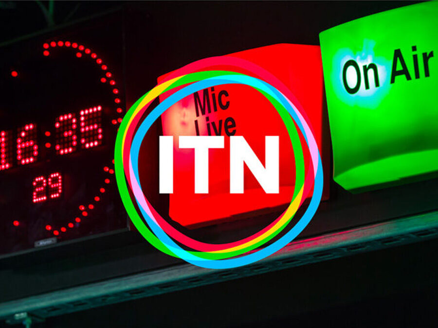
The new brand positioning, narrative and visual identity has been headed up by agency partners Rudd Studio and Undivided. It replaces ITN’s famous static logo from the 1970s with a new animated logo.
The old ITN logo, with its famous linked letter forms, has been in place since 1970 and seen only minor changes, making it one of the longest-standing logos in UK broadcasting. ITN’s new brand identity is built around a newly defined purpose and a new strapline – “Truth to Life”.
ITN CEO Rachel Corp said: “Our challenge was to pay homage to our powerful legacy as a trusted, impartial news provider, at the same time as rearticulating who we are and what we stand for today. We homed in on how we are a purpose-driven organisation with a mission to bring ‘truth to life’ and put people at the heart of everything we do. This resonates across all parts of ITN and creates a distinctive and future-facing business proposition with a clear ethos.”
Founded in 1955 by the fledgling ITV network, its business now comprises seven distinct divisions – Business, Education, Newsrooms (ITV News, Channel 4 News and 5 News), News Production, Post Production, Productions, and Sport. ITN’s output ranges from the World Athletics Championships to award-winning documentaries and high-rating popular factual series for the major UK and international broadcasters and streaming platforms, as well as educational programming, short-form content and hybrid events for charities and businesses.